Facebook Mobile Cover Photo Tips & Tricks
(Editor's note: If you're visiting from 2015, enjoy this post! If you're visiting today, please check out our fully updated Facebook Mobile Cover Photo Tips & Tricks with new free downloads.)
Ever wonder why some Facebook cover photos look better than others on mobile? The answer is always a great designer (not that I'm biased or anything), but I recently discovered a nifty trick to help less of your hard work get cut off when viewing from a mobile device - and still look great on desktop.
Terrible as I am at remembering numbers, I'm always googling "FB cover photo size" (or viewing our quick-reference infographic), and the first answer that always pops up is 851x315, which is what the cover photo displays at on a desktop browser. If your only concern is desktop, this is a fine size to upload your cover photo. Unfortunately, we cannot ignore the 798 million users who access Facebook daily through their mobile phones.
Before I found this trick, options for optimizing a cover photo for both desktop & mobile were very limited: either make the focal point very small to display properly on mobile, or make it look good on desktop and sacrifice the mobile experience.
Ugh.
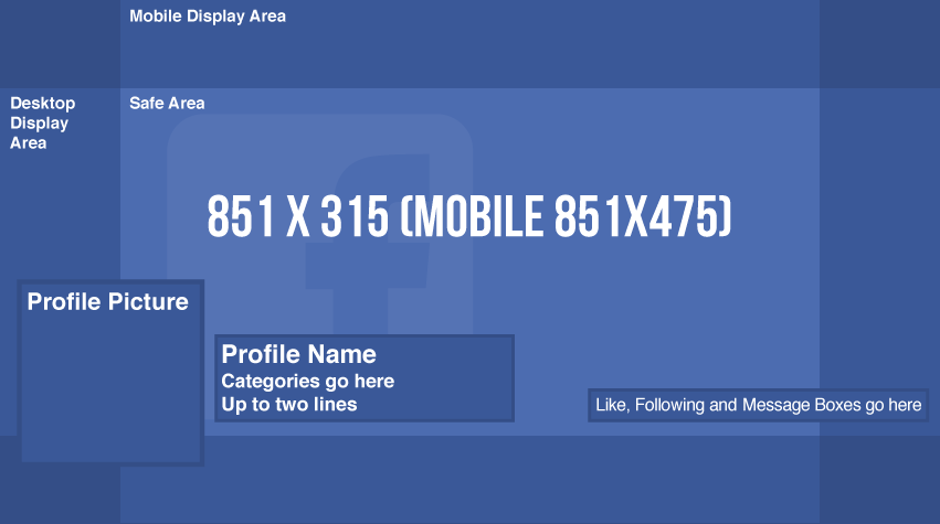
OK, I'll cut to the chase. Upload an image that is 851x475. With cover photos taller than desktop shows, two things happen:
- Desktop cuts off the top & bottom of the image (luckily, it cuts off an equal amount from both)
- Mobile will still cut off some of the sides of the image, but we have a significantly larger viewable area
This gives us a much more flexible canvas to work with, and a richer experience on both desktop and mobile. Anything within the "Safe Area" above will display properly!
Feel free to download our handy cover photo templates (updated in 2017) as Adobe Illustrator Template(.ait), and Photoshop(.psd) files.
